Reels-First Ads: The Smartest Way to Make More Money From Your Meta Ads in 2025
Oct 22, 2025
Meta just revealed their secret for better ads results $$$.
Let’s be real: if you’re still designing ads for the Feed first, you’re basically showing up to a Reels party in a PowerPoint.
It’s not the vibe. Meta’s made it crystal clear: the ads getting the best results right now aren’t over-targeted or over-budgeted… they’re built for Reels from the start.
Reels-first ads consistently outperform other placements delivering up to 13% higher ROAS and 16% lower CPA on average.
In plain terms? They lower your ad costs, increase your returns, and make scaling so much easier.
Vertical. Sound-on. Safe-zone tight.
Why do you think all the creators use them… like, duh!
Let’s talk about how to make your next campaign actually perform like it’s 2025.
Want to see what top creators are doing with Reels right now?
Before we dive in, I made a quick $9 video tutorial showing you how to use the Meta Ads Library to find and analyse your competitors’ best-performing ads.
You’ll learn how to:
✔️ Spot what’s working in your niche
✔️ Save time on creative research
✔️ Turn insights into better-performing ads
It’s fast, practical, and costs less than your almond latte.
👉 Watch it here.
WHY "REELS-FIRST" ISN'T A TREND — IT'S THE BARE MINIMUM
Attention is the new currency, and Reels are where people are spending it.
They’re full-screen, full-sound, and full of your competitors already testing this stuff while you’re resizing a square ad (don’t be that person).
If you only have time for one creative format, make it 9:16 vertical.
Everything else can be cropped later.
Your Reels can’t.
THE R.E.E.L.S. FRAMEWORK
Because we love a good acroynm!
R – Ratio: 9:16 or bust.
E – Ear: People scroll with sound on now — act accordingly.
E – Edge-Safe: Don’t let your offer hide under a “Learn More” button.
L – Layers: Talking-heads. UGC. Demo. Offer. Testimonial. Give Meta options.
S – Scale: Crush it on Reels first, then crop it for Feed, Stories, Explore — whatever’s left.
Sounds cute, but let’s talk about how to actually do put it in practice.
Audio Isn't Nice-To-Have — It's A Conversion Tool
Reels are sound-on. Full stop.
Meta’s data backs it up. Ads with music, voiceover, or brand audio cues don’t just get watched longer, they get remembered.
So:
🎧 Use Meta’s Sound Collection (no copyright nightmares).
🎧 Or switch on Advantage+ Creative → Music to let Meta find you something decent. Then, you be the editor to make sure it’s on-brand.
If it sounds like elevator music, it probably is.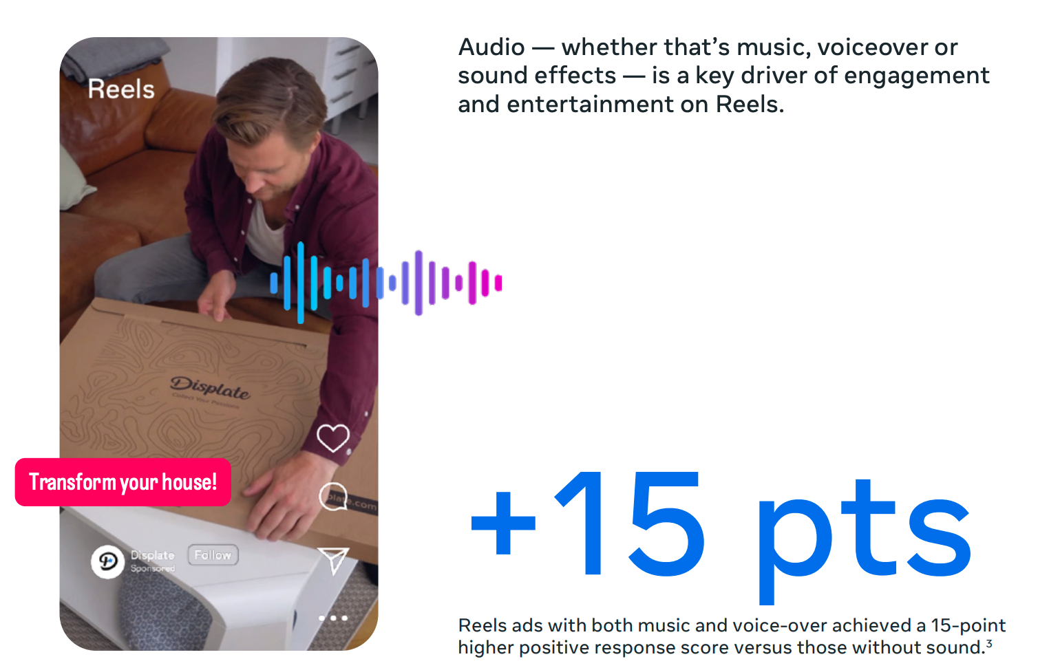
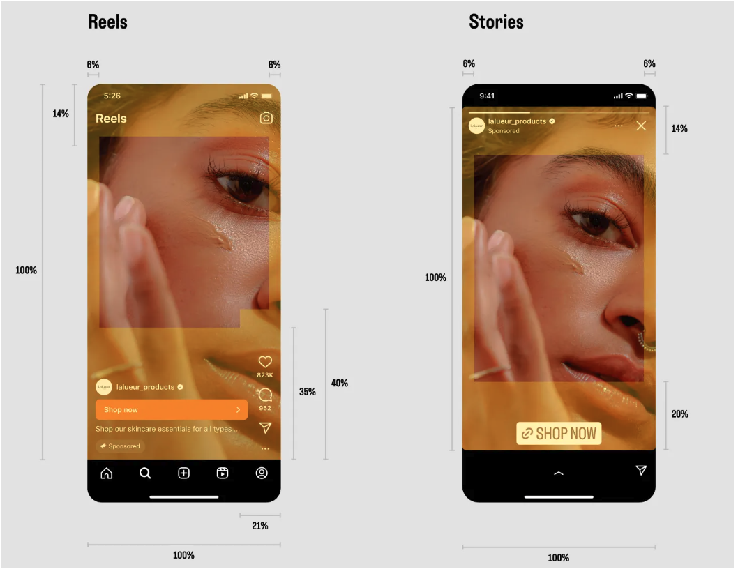
Safe-Zone ≠ Optional
Design like a pro who actually knows where the buttons go.
Meta literally says: keep the bottom 35% clear of text and logos, or your ad will look like it was built in the dark.
Test it using Meta’s Safe-Zone Checker effect or use my golden rule:
👉 If your CTA lives where your caption bar does, it’s already dead.
According to Meta's Reels Ad Guide, creative that stays inside safe zones and uses vertical 9×16 layouts earn higher engagement across every placement.
Human, But Make It Scroll Stopping
Faces sell. Movement sells. Relatable sells.
If you’re hiding behind B-roll and product shots, you’re missing the human connection Reels are built on.
Show yourself. Show your customer. Show someone doing something that isn’t just pointing at text bubbles.
Think less “stock footage,” more “friend telling you a secret that might make you money.”
The language of Reels (and how to speak it fluently)
Meta calls it relatable, digestible, entertaining. I call it don’t bore me before the hook lands.
When you’re creating:
- Relatable: Talk like a human, not a brochure.
- Digestible: One idea per frame, captions that keep up.
- Entertaining: Move fast, break patterns, end before they expect you to.
Meta Ads, Your Advantage
✔️ Ads made for 9:16 outperform images and non-vertical video.
✔️ Reels with a person in frame get higher click-through rates.
✔️ Text stickers and brand sound cues = more positive reactions.
✔️ Staying inside the safe zone = more people actually see your offer.
Translation: Follow the rules, then make them look effortless.
N.B. A brand sound cue is any consistent, recognisable element — visual or audio — that instantly signals it’s you.
Creative Variety = Build-in Scaling
Meta’s AI can tell who’s cold, warm, and ready-to-buy inside one campaign.
Your job? Give it options to play with and A/B Test
Mix:
- One talking-head
- One UGC-style testimonial
- One offer-driven promo
- One text-overlay B-roll
- A testimonial with social proof
If you only upload one creative, you’re basically serving Meta a single cracker and calling it a charcuterie board.
STILL TEST STATIC + CAROUSEL ADS
Before you go Marie-Kondo-ing your ad library — don’t.
Reels-first is the rule, not the religion.
Static images and carousels still earn their keep.
Meta’s own data shows that creative diversity wins every. single. Time.
This is particularly true when it comes to scaling. Don’t throw the baby out with the bathwater.
Your Reels grab the scroll.
Your carousels and static templates seal the deal with clarity, proof, and polish.
And look, I know, I know, Reels can feel painful to make.
The filming, the editing, the lighting… 😩
But you either want the dollars or you don’t.
Your audience might surprise you too.
Some will binge your Reels; others will click a clean graphic because they’re wired for visuals, not video.
As you go further up the sales funnel, you’re going to need the variety. Boring doesn’t convert.
You won’t know which until you test and real business owners chasing success test everything.
So yes, go vertical first.
But keep a few killer carousels and images in the mix because a great message (and a gorgeous template) never goes out of style. 💅
THE REELS EXPORT PACK
(A.K.A. DON’T UPLOAD CHAOS)
✔️ Master file (9:16, 1080×1920)
✔️ Captions baked in
✔️ Audio added
✔️ Square + 4:5 crops
HOOK LINES THAT DON’T SOUND LIKE EVERYONE ELSE
Lead with a hook — the first three seconds decide your success.
Pattern interrupt: “Stop doing X; do this instead.”
Buyer myth: “Everyone says ___. Here’s what actually works.”
Curiosity Trigger: “This shouldn’t work… but it does.”
FINAL WORK: BUILD FOR HOW PEOPLE ACTUALLY SCROLL
Reels aren’t just another placement, they’re the main stage.
Designing for Reels isn’t about chasing trends; it’s about meeting attention where it lives.
And that’s exactly where Meta is focusing its energy right now.
It’s non-negotiable especially heading into the busiest time of the year on the platform.
When your creative looks native, sounds intentional, and lands your offer inside the safe zone, you stop guessing and start scaling.
So go build something vertical, sound-on, and impossible to scroll past.
You’ll thank yourself (and so will your ROAS).
BONUS TIP
Meta may be favouring Reels right now, but don’t assume your audience behaves the same way.
Some niches still crush it with carousels and statics. The only way to know?
Test it. Measure it. Then double down on what performs.
NEXT STEP
Now that you know how to build Reels-first ads that convert, it’s time to spy smart.
Grab my $9 Meta Ads Library walkthrough, and I’ll show you exactly how to find and reverse-engineer the Reels creative that is performing best right now.